When designing for print, even the most experienced designers can make mistakes that compromise the final product. Unlike digital designs, print comes with its own set of technical considerations that must be accounted for to ensure your project looks professional and polished. Whether you’re designing business cards, brochures, or large banners, understanding the nuances of print design can save you time, money, and headaches. Here are some essential tips to avoid common mistakes and create print designs that stand out.
Understand the Difference Between RGB and CMYK
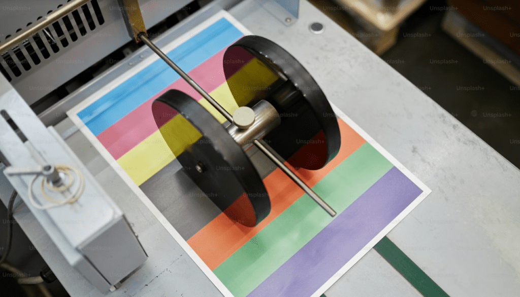
One of the most common mistakes in print design is using the wrong color mode. Digital screens use the RGB (Red, Green, Blue) color model, while printers rely on CMYK (Cyan, Magenta, Yellow, Black). Designing in RGB can result in colors appearing dull or inaccurate when printed.
Tip: Always set your document’s color mode to CMYK from the start to ensure color consistency in print.
Set the Correct Resolution
Images that look crisp on a screen may not translate well to print if the resolution is too low. Print requires a resolution of at least 300 dpi (dots per inch) to maintain clarity and avoid pixelation.
Tip: Avoid using low-resolution images sourced from the web (usually 72 dpi) for print projects.
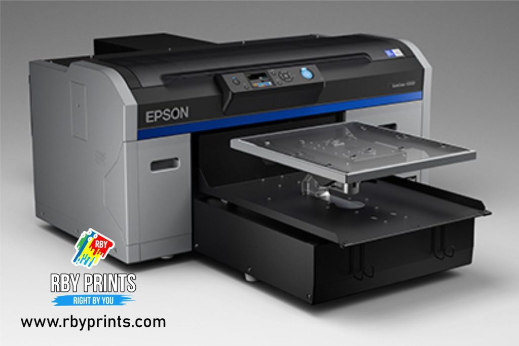
Read More: Understanding Direct-to-Garment Printing: What Is DTG Printing?
Include Bleed and Safe Margins
Bleed ensures that your design extends beyond the trim edge to prevent white edges from showing if the paper is cut slightly off. A standard bleed size is 0.125 inches (3 mm). Safe margins, on the other hand, ensure that critical text or elements are not cut off.
Tip: Leave a margin of at least 0.25 inches (6 mm) inside the trim area for important content and use the bleed feature in your design software.
Use Vector Graphics for Scalability
Raster images (like JPEGs) lose quality when scaled, while vector graphics maintain their sharpness at any size. This is especially important for logos and text.
Tip: Use vector formats like AI, EPS, or SVG for elements that need to be resized frequently.
Choose Fonts Wisely
Fonts play a critical role in the aesthetics of your print design. However, issues can arise if you use non-standard fonts that aren’t embedded or converted to outlines.
Tip: Use professional fonts and ensure they are embedded or outlined before sending the design to the printer to prevent font substitution.

Check Color Contrast and Readability
Low contrast between text and background can make your content hard to read. Similarly, overly decorative fonts or using too many font styles can clutter the design.
Tip: Prioritize legibility by testing your design with print proofs and avoiding overuse of decorative elements.
Avoid Overusing Rich Black
Rich black (a combination of all CMYK values) can be useful for large, dark areas but may result in smudging or over-saturation when used excessively.
Tip: Use standard black (K=100) for text and rich black for large solid areas to maintain crispness.
Double-Check Spelling and Grammar
It may sound obvious, but typos and grammatical errors can ruin the professionalism of your design. Unlike digital media, printed materials can’t be easily corrected once finalized.
Tip: Proofread multiple times and consider having a colleague or client review the content.
Read More: 👕💰 Ready to transform your creativity into a thriving business?
Ensure Accurate File Formatting
Sending the wrong file format to the printer can cause delays or result in suboptimal quality. Common print-ready formats include PDF, AI, and EPS. Ensure all linked images are included if you’re providing native files (like InDesign files).
Tip: Save your final design as a high-resolution, print-ready PDF with all fonts embedded and layers flattened.
Test with Print Proofs
Before committing to a full print run, request a proof from the printer. This will allow you to catch any errors in color, alignment, or content.
Tip: If possible, request a physical proof rather than a digital one for the most accurate representation of the final product.
Pay Attention to Paper and Finishes
The type of paper and finish you choose can significantly impact the final look of your design. Glossy finishes enhance color vibrancy, while matte finishes give a more subdued and elegant appearance.
Tip: Discuss options with your printer and choose the paper and finish that best suits your project and brand image.
Communicate Clearly with Your Printer
Miscommunication with your printer can result in costly errors. Provide detailed instructions about your project, including dimensions, bleed, and specific finishes.
Tip: Confirm all specifications in writing and review the printer’s guidelines before submitting your files.
Conclusion
Designing for print can be complex, but with careful attention to detail and a clear understanding of print processes, you can create stunning and professional materials. By avoiding these common mistakes, you’ll not only save time and money but also ensure that your designs make a lasting impression. Remember, print is permanent, so taking the extra time to get everything right is well worth the effort.
Request a quote here to place an order with RBY Prints today!

